What would whisky look like if it was made by the Germans? Would it be frivolous, coarse and folk like a Bavarian beer festival? Or rather Teutonic, laboratory and studied like BMW?
Naming, Packaging
We felt that it was necessary to look at this task more broadly and try to adjust the image of the product to the visual conventions and stereotypes that Poles associate with their western neighbours. We asked ourselves what, in the process of creating whiskey, can fit the image of the Germans? Certainly, it is created with pietism resulting from attention to detail, with reliability, accuracy, even a laboratory approach to the entire process.
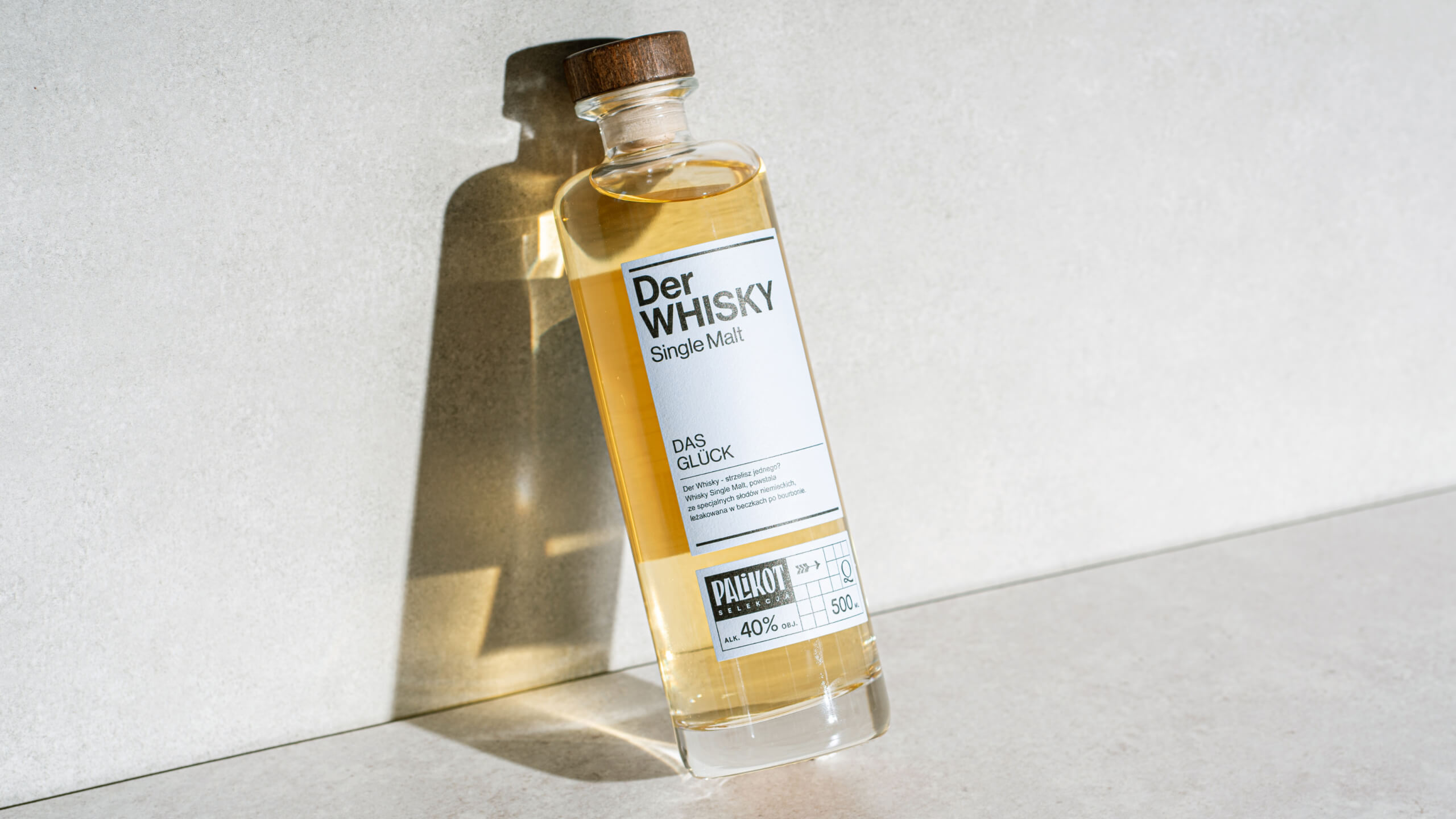
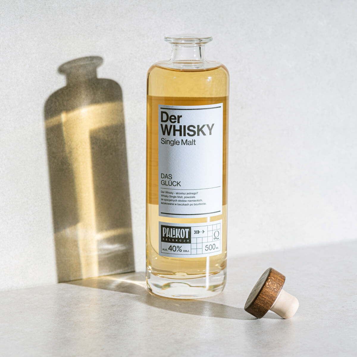
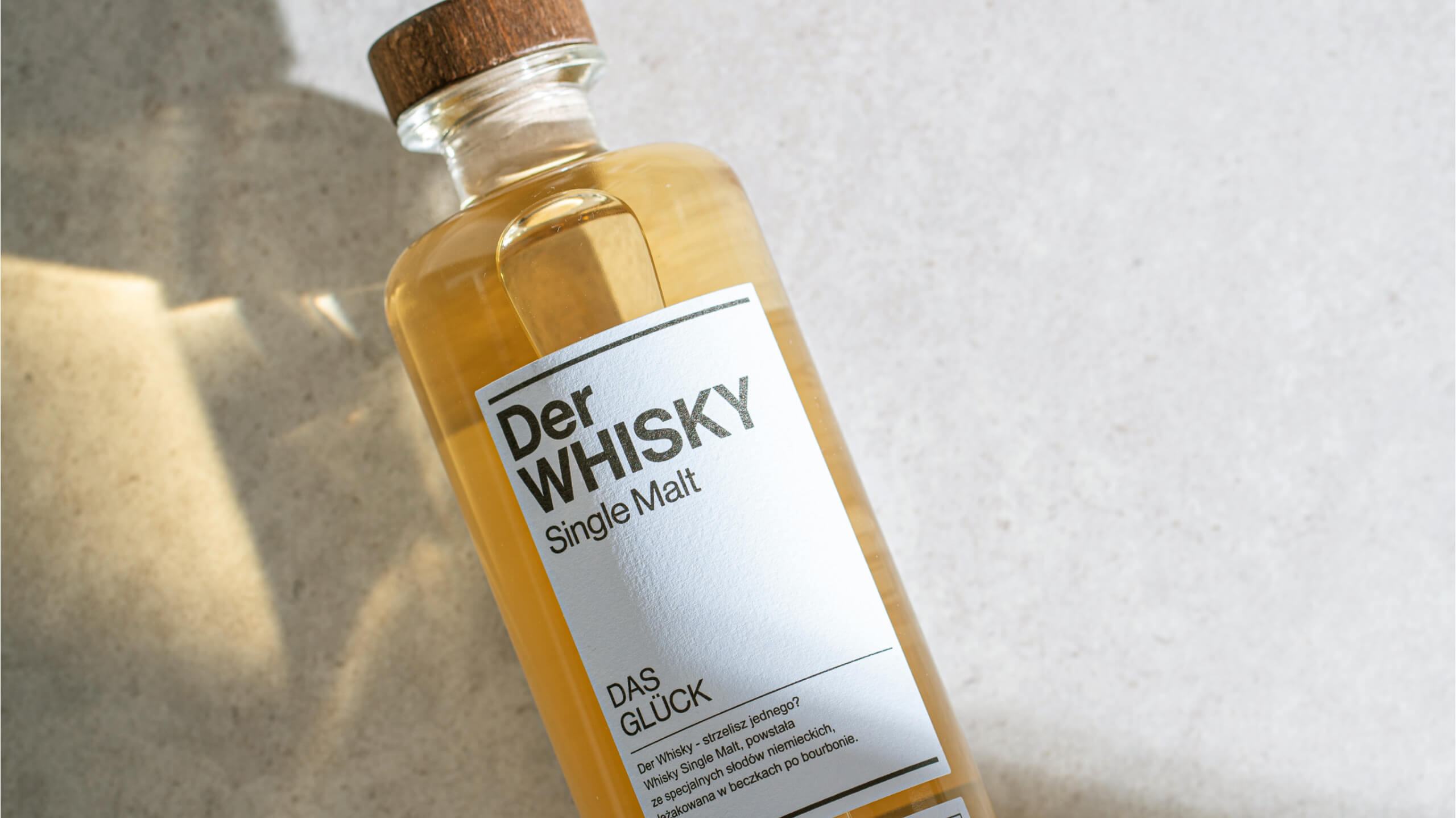
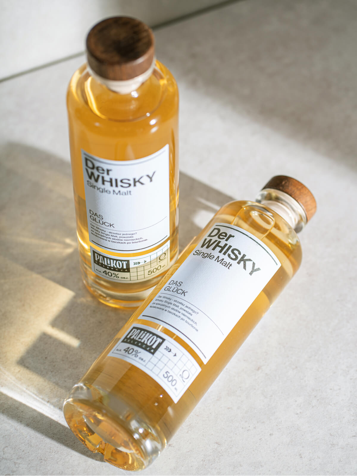
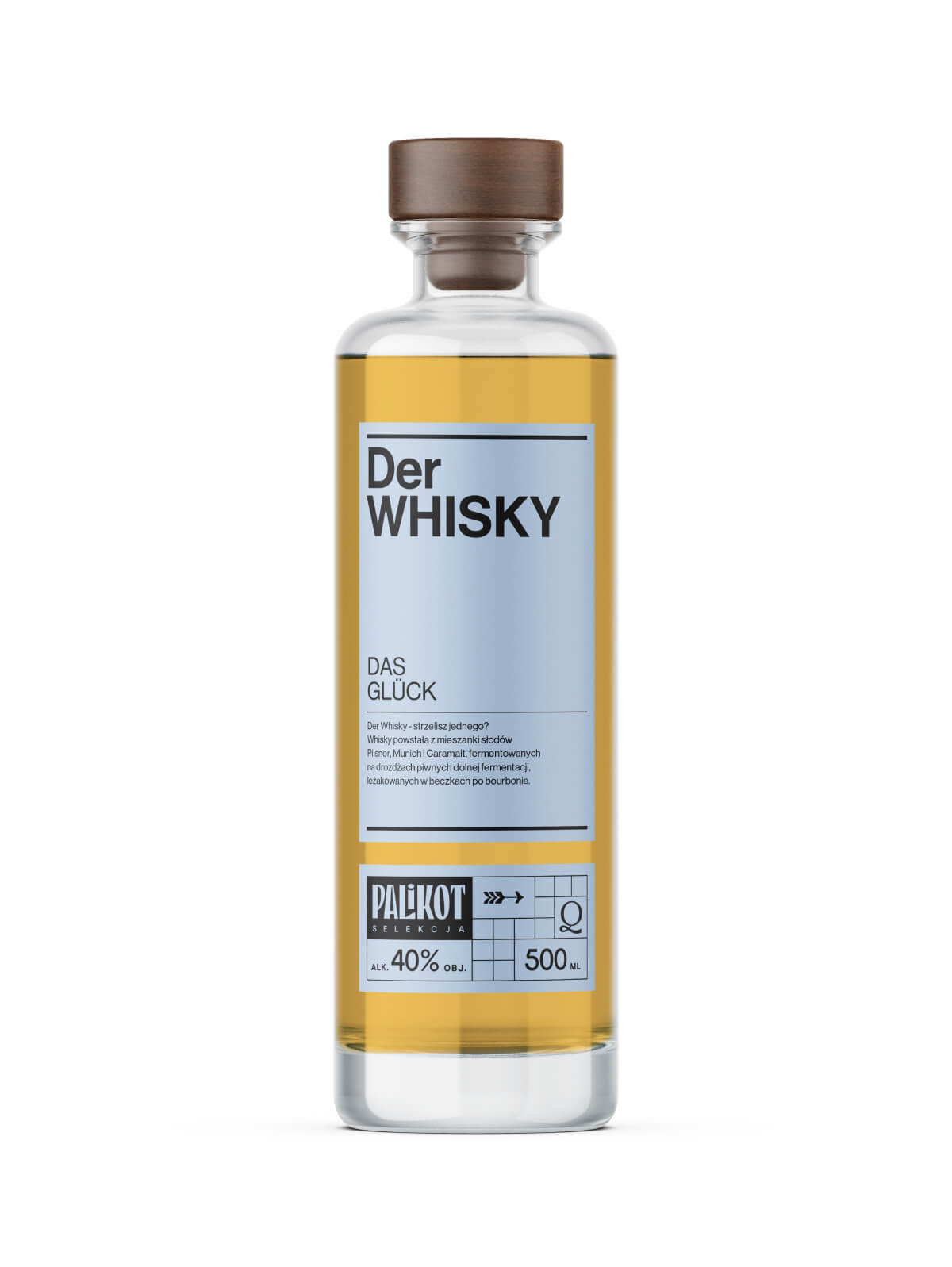
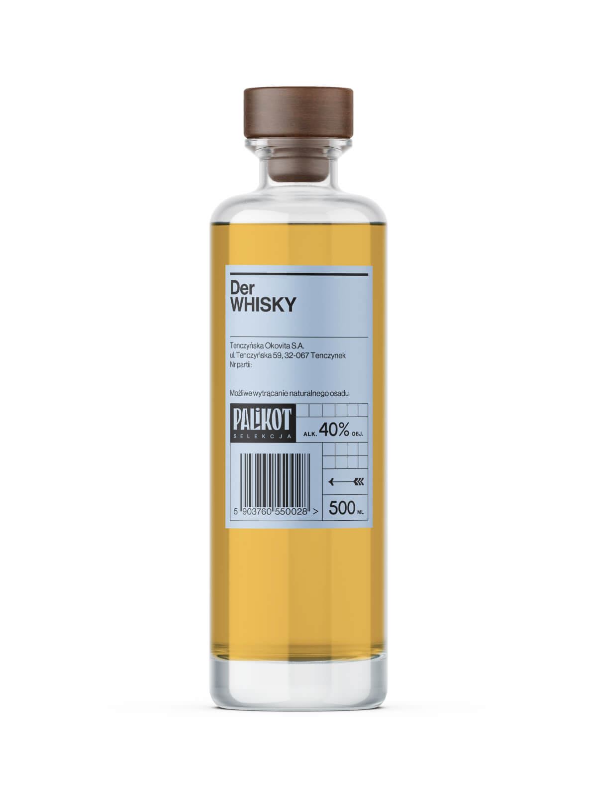
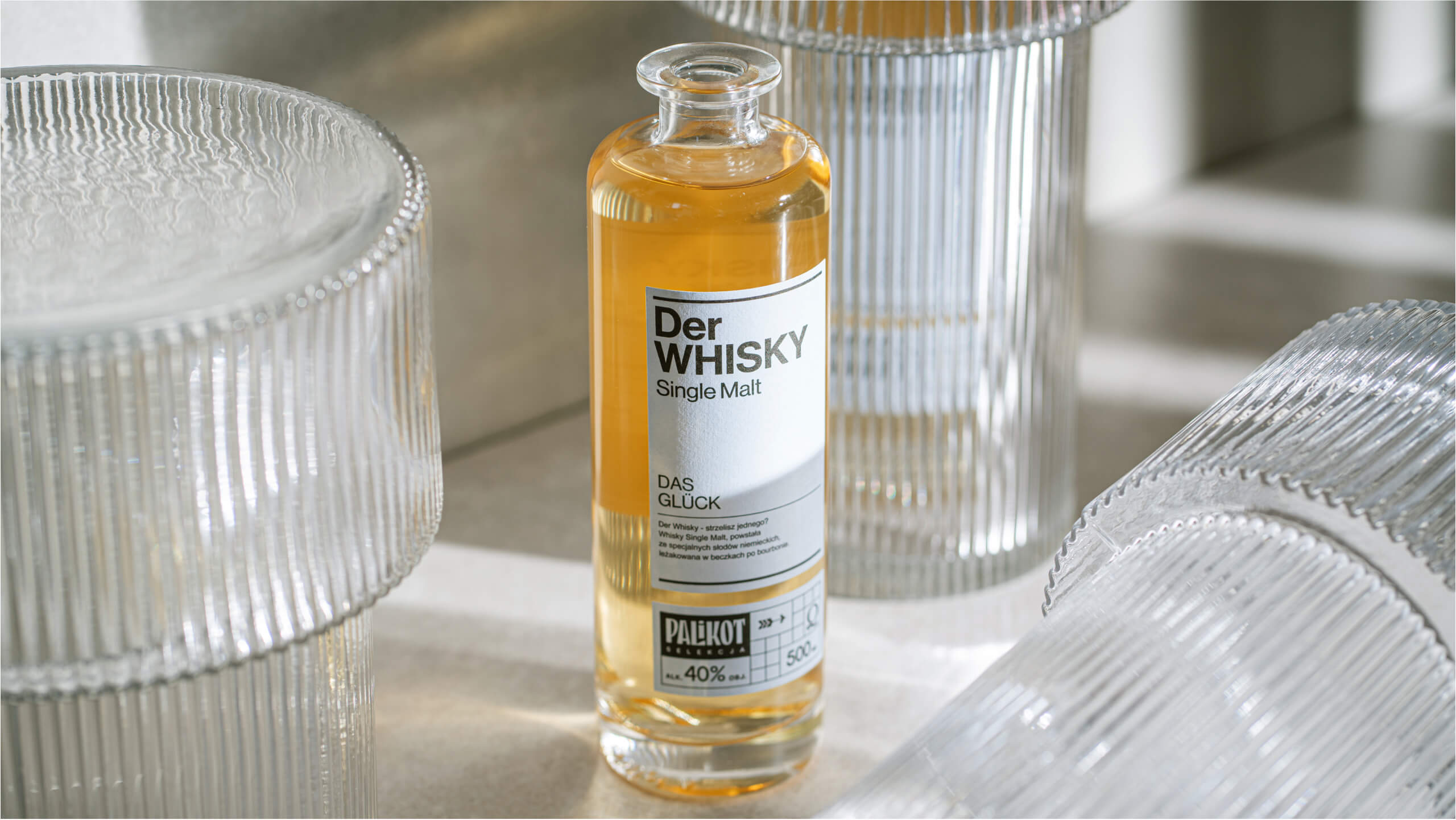
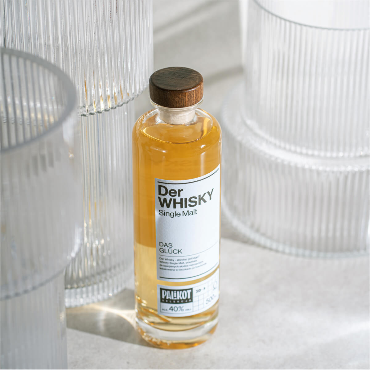
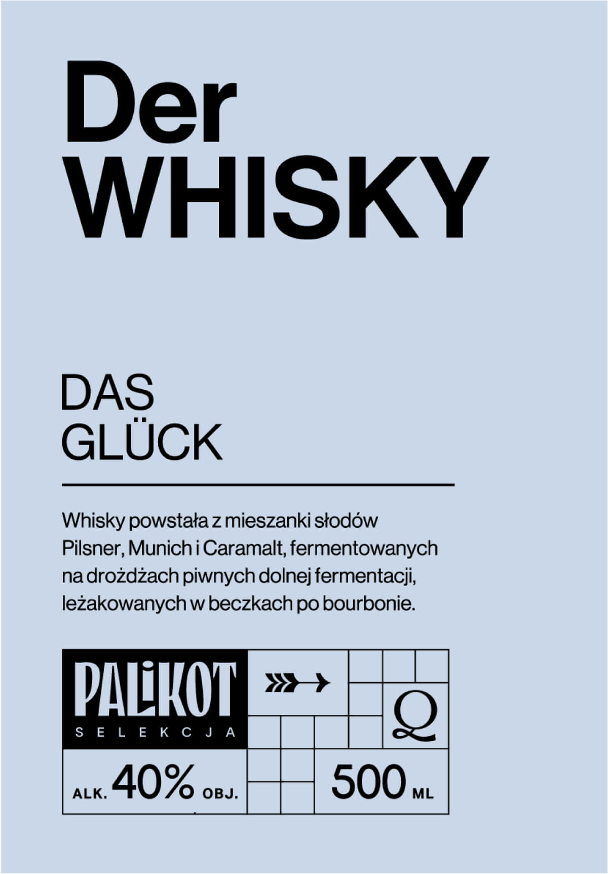
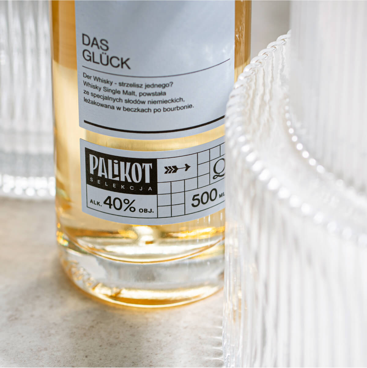
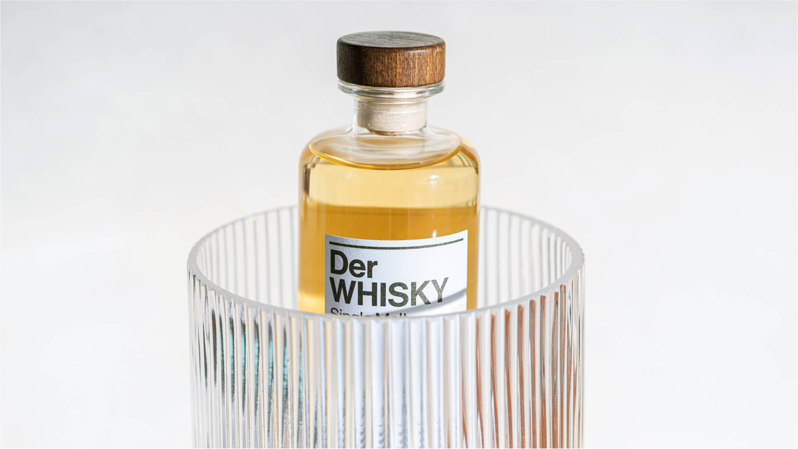
The idea of ”German Engineered Whiskey” determined the name and visual language of the brand. The name “Der Whiskey” with a grain of salt refers to German rationalism.
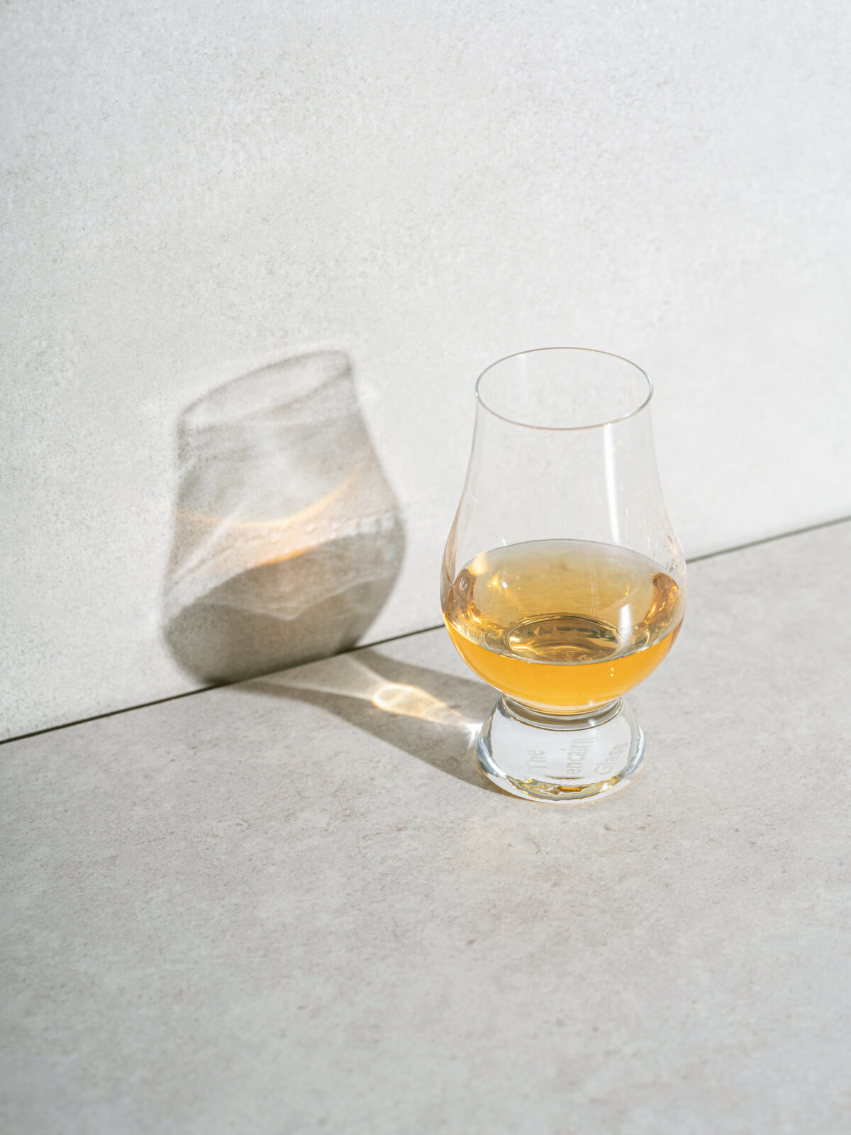
The second important element of the concept was the decision about the shape of the bottle. The simple, cylindrical form evokes associations with pharmacy and laboratory measures and precision. Rectangular labels, the use of one colour and a balanced, conservative composition of typographic elements complete the image of Der Whiskey.
Mamastudio for Teczyńska Okowita SA
Scope
Packaging
Naming
Project Management
Piotr Ręczajski
Design
Marta Przeciszewska
Art Direction
Michał Pawlik
Naming
Piotr & Michał
Photo & Motion
Paweł Marcinkowski
Related projects
Palikot Vodka
Palikot craft vodkas series
Whisky Palikot
Peat smoke in a glass straight from Scotland to Poland