Park of Poland

Park of Poland is an investment that has never been in Poland before. It is several hundred hectares of land, the heart of which is the Suntago water park.

Brand Identity, Communication

The first Park of Poland investment in Poland is the Suntago water park – one of the largest projects of this type in this part of Europe. In the future, it will gather more attractions around it, such as amusement parks and hotels.

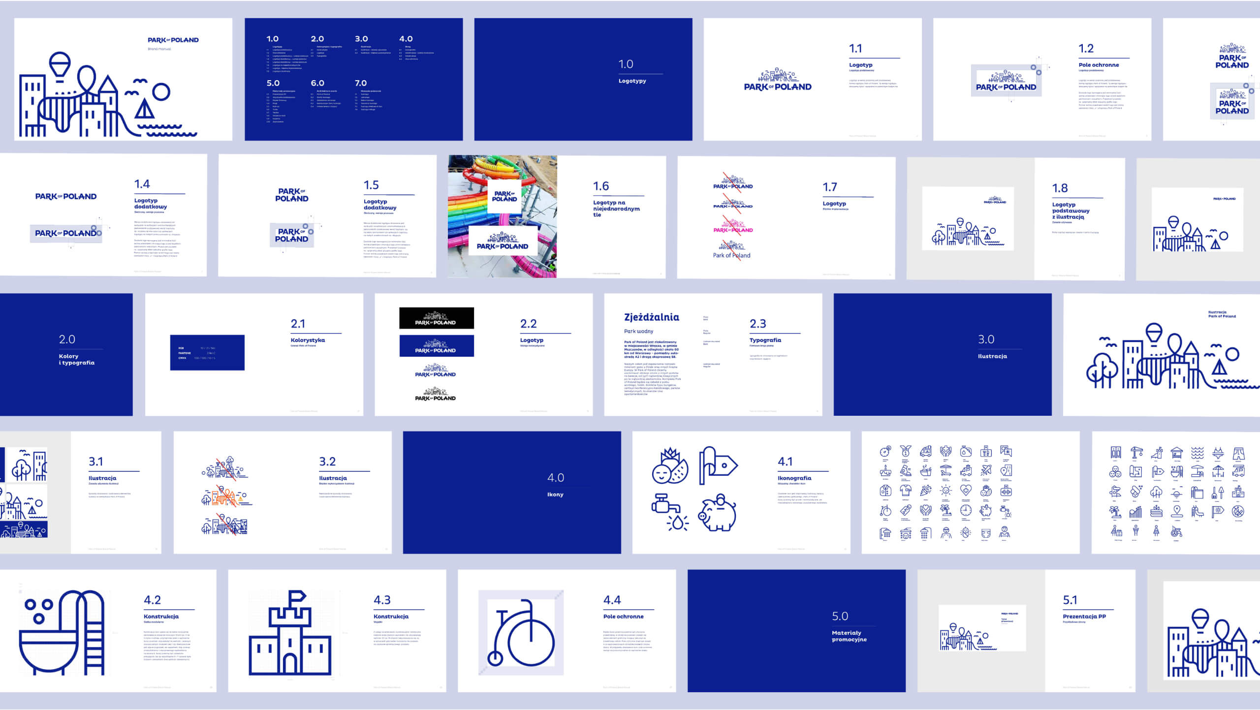
We have prepared a complete visual identification for the Park of Poland. Graceful, sans-serif lettering of the logotype combined with an extensive linear sign is associated with rest and relaxation. The “professional” dark blue suggests the business approach of investors, which is limited to the term “bleisure”, i.e. the marriage of business travel with recreation and entertainment (business + leisure).

The Park of Poland logo has become an inspiration for the further development of the brand image. A well-thought-out layout of printed materials, a colour palette limited to business dark blue and pure white, and a simple typeface are behind the success of Park of Poland’s simple but effective graphic design.

Linear illustrations are an important element of Park of Poland’s identification. Thematically and stylistically they refer to the water park theme presented in the logo. The illustrations are accompanied by a system of icons carefully drawn on a grid. It has been designed so that it can be easily expanded and developed. Icons and illustrations have been implemented in the investor’s materials for good. They are also constantly present on the company’s profile on social media.

Mamastudio for Park of Poland

Scope

  • Art Direction
  • Branding
  • Visual language
  • Project Management

    Piotr Ręczajski
  • Design

    Zuzanna Rogatty