Palikot's beasts, that is, what is best in vodka — fun, feasts, anecdotes.
Packaging
IDEA
A dose of humour and craft vodka produced from the best of the Polish fields — barley, rye and potatoes. We have expressed the honesty and quality of the product in several ways. First of all, we used illustrations of animals typical of the Polish countryside. Their selection was not accidental.
BEASTS
Geese like barley and are fed with it. The mole passes the potatoes underground. Frog because of the Polish proverb about the frog and rye. Hearty messages in the form of stamps fit in with the character of the brand.
PACKAGING
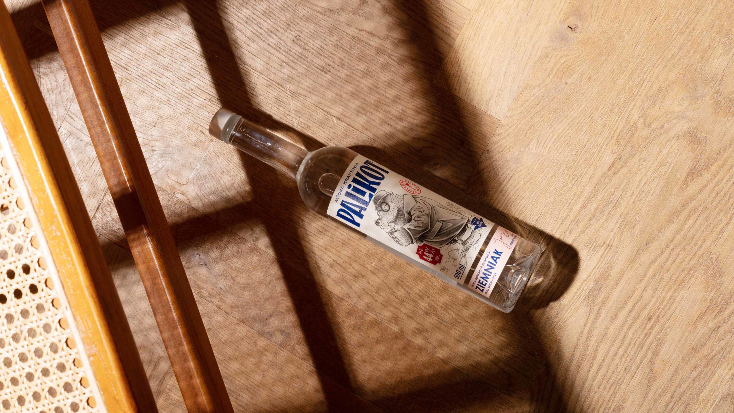
The form of the bottle refers to the classic pre-war thin-necked half-litre bottles – the kind we remember from grandma’s cupboards. The double front label with flavour descriptions will refer to deeper and non-obvious taste sensations. Raw and restrained printing on high-quality but simple paper reflects the honesty of the product.
KRAFT VODKAS
The “Bestie Palikota” series is a response to the fledgling, but ever faster growing market of craft vodkas. We came up with a packaging that embedded new products in the vodka category, but most of all captured the honesty of a craft product.