Whisky Palikot
IDEA
This is the first step that Janusz Palikot takes before introducing his own whiskey to the market. The launch of “Palikot Selekcja Scotch Whisky” is also an opening of a discussion on the future of Polish premium whisky.
DETAIL
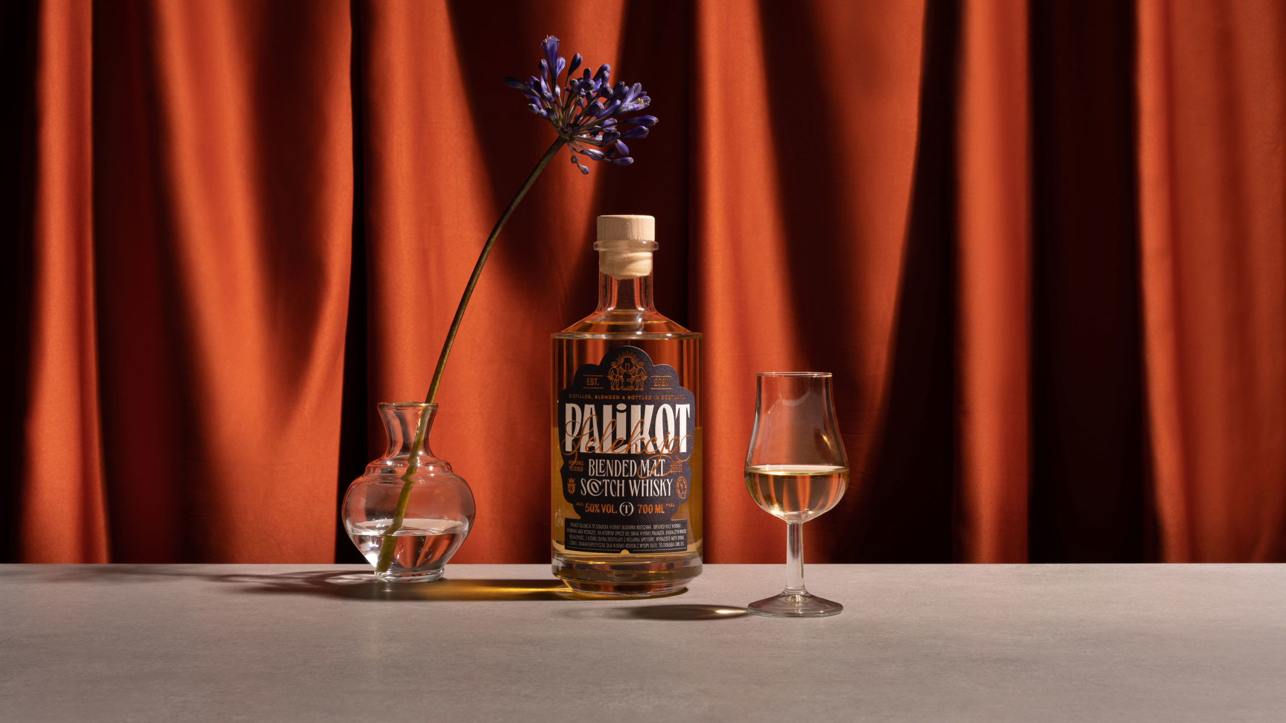
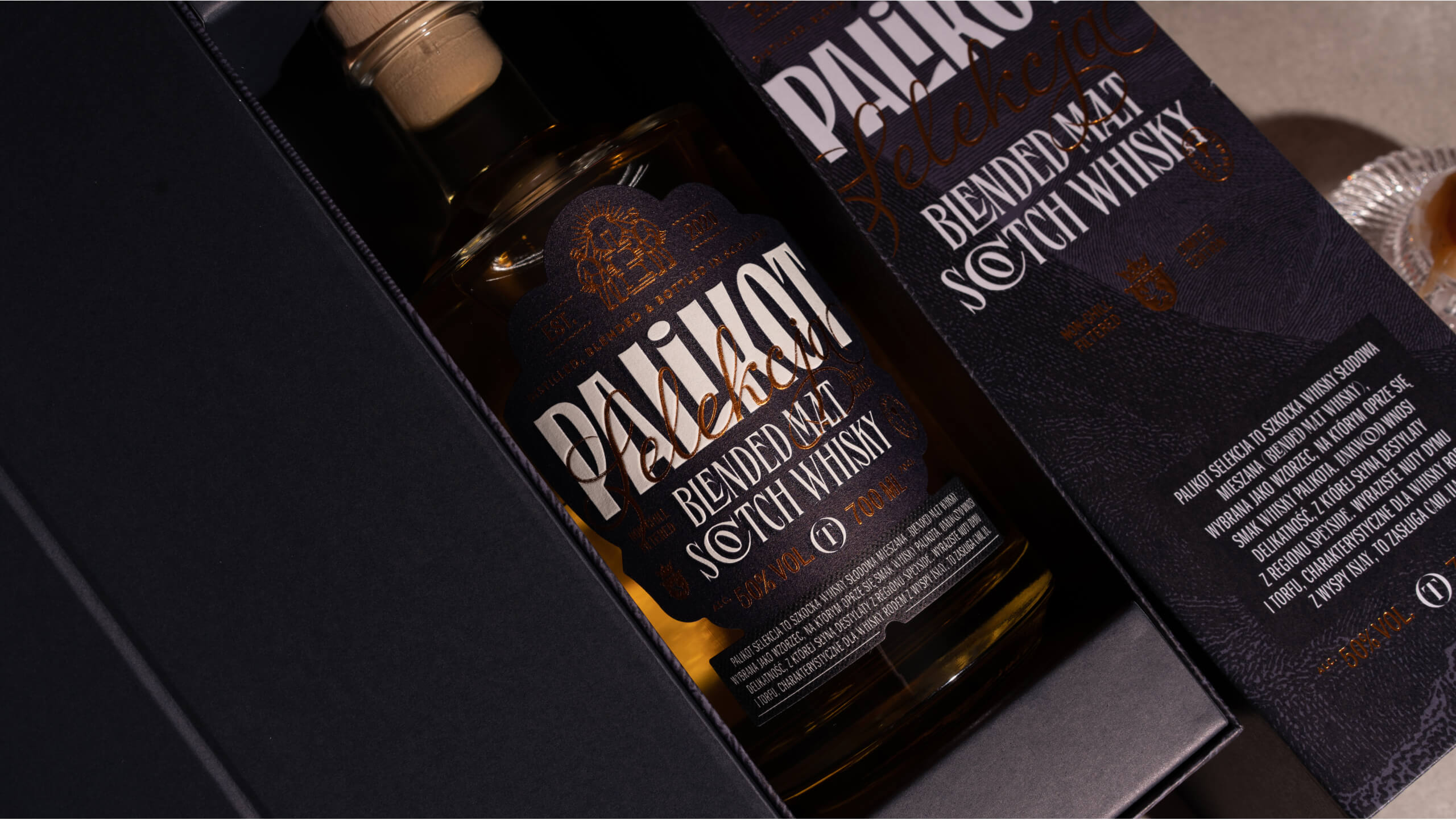
The design clearly shows the visual codes characteristic of the whiskey category broken with Palikot’s personality traits. The “presence” of Palikot on the label seemed to be crucial for maintaining whisky sales at PLN 425 per bottle.
APPEARANCE
For the project, we used a classic whisky bottle used by foreign premium brands. The label design is based on two strong visual assumptions. The first is its unique shape, which stands out a lot today and gives the product its character, and in the future it will allow to consistently expand the portfolio with new products.
The second element is a characteristic typographic assembly. The typefaces of the fonts are associated with luxury and the richness of the taste of whiskey. A year after its premiere, we designed the Batch No. 2 label. The second bottling was getting ready.
Mamastudio for Teczyńska Okowita S.A.
Scope
- Art Direction
- Packaging Design
- Strategy
-
Photo
Paweł Marcinkowski