Natural washing cosmetics for men, with the addition of charcoal burnt in the Polish Bieszczady Mountains.
Brand Identity, Packaging
“Zew For Men” are natural washing cosmetics for men containing charcoal from the Bieszczady Mountains.
Our task was to design packaging that communicated strength, naturalness, masculinity and an active lifestyle.
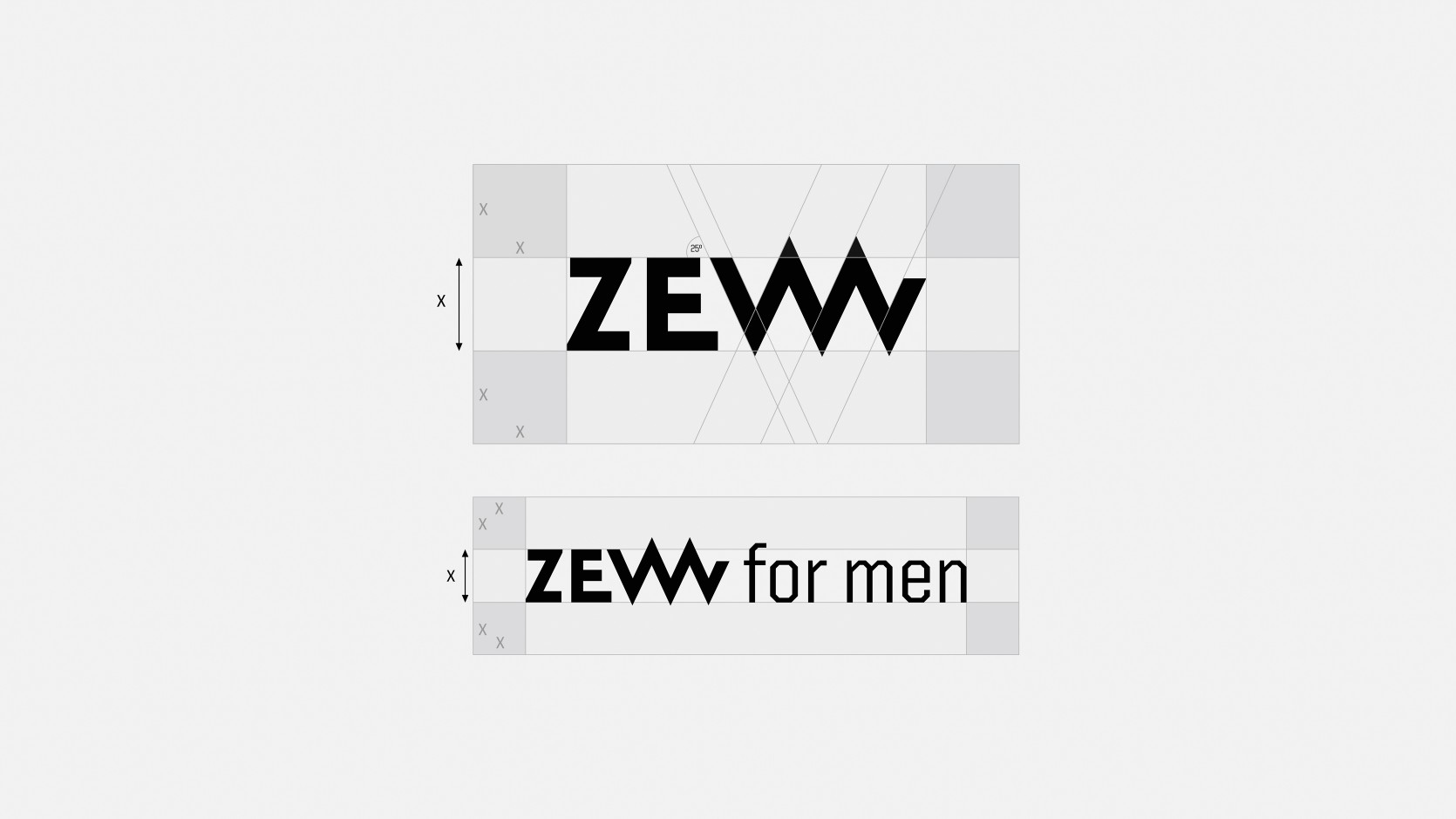
Black colour and characteristic typography distinguish the packaging and give it a distinctive character. The shape of the letter “W” in the brand’s logo refers to the mountains.
An important element is a signet with a pen element and geographical coordinates showing the place of origin of the key ingredient of the product – coal from Bieszczady.
Mamastudio for Zew for Men
Scope
Naming
Brand Identity
Packaging
Art Direction
Project Management
Magda Assanowicz
Design
Konrad Sybilski
Art Direction
Michał Pawlik
Copywritng
Eric Hurless
Photo
Paweł Marcinkowski
Related projects
Under Twenty
Dr Irena Eris Cosmetic Laboratory brand
Tank Productions
The boutique nature of the company and the high quality of the services provided