Adapted to digital reality, visual language communicates the simplicity, functionality and availability of Profim products.
Brand Identity, Digital Branding
REBRANDING
When creating a new system of visual identification, we focused on functionality and simplicity. We wanted it to be clear and easy to use. We tried not to lose the brand’s Polish lineage resulting from the history and assumptions of the Profim company.
NEW LOGO
The previous logo was delicate, timid and rounded. We wanted the new logotype to express self-confidence, precision, scale and professionalism of the brand, and to emphasize good design and quality. The implementation of these assumptions are, i.a. details in typography, including the characteristic form of the letter “f”.
LAYOUT
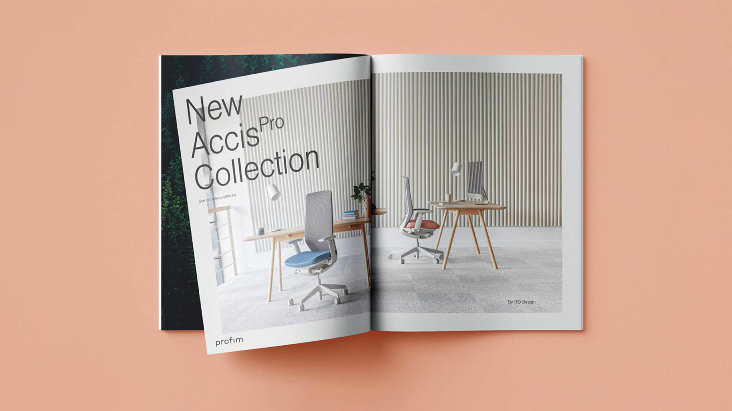
All materials and layouts are constructed in such a way that the chairs are in the centre of the composition. We have presented them as small works of applied art and surrounded them with a frame. Simple and legible typography is scaled up, it comes out of the frame, which gives a modern, but comfortable effect.
TYPOGRAPHY AND COLORS
The colour of the frame used in the materials results from the colour of the upholstery of the presented chair. It is in a slightly lighter shade and therefore becomes a good background for a piece of furniture that comes to the foreground. We have used scaled typography that remains legible despite the fact that it is obscured by chairs. We have also used the frame layout in social media. Owing to this, the brand has a coherent image – in the digital space and in printed materials.
ILLUSTRATIONS
In cooperation with Michał Loba, we have created a collection of illustrations that present furniture in various contexts and add emotions to them. Thanks to this, they can be an inspiration for furnishing both office and home workstation.
We have created the world of Profim from scratch. In addition to preparing the identification, we have designed a set of icons, technical drawings of furniture, a template and a brand book.
Mamastudio for Profim
Scope
Art Direction
Branding
Visual language
Naming
Project Management
Alina Kostiuk
Design
Maciej Bączkowski, Gabi Golińska
Art Direction
Michał Pawlik
Illustrations
Michał Loba
Photo & Motion
Kuba Kossak, Aleksander Jezierski
Related projects
Empik
Integration of the visual identification system of the iconic Polish brand